|
|
New games every week!
Tuning via Tweets
Blog
11th June 2020
A couple of suggestions on Twitter last night.
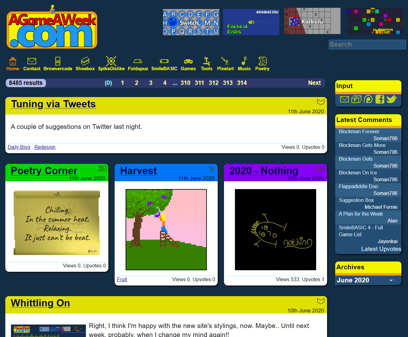
-=-=- @McFunkyPants suggested removing the underline from the main boxes, but I'm not a fan of Links that aren't underlined. That might very well be a "Web 1.0" feature, but damnit, it's visible functionality!! I have, however, lightened the underline so it's less pronounced. It's a middleground.. Speaking of middlegrounds, @elhector chipped in and suggested that the old site looked "complete" and themed, whereas the new one looks like it's in a weird unecertain hazy place between Web 1.0 and modern websites. And I'm not going to disagree... But .. I think I like it!!  Players of my games know how my graphics/gameplay are definitely not sticking to 8-bit rules, but aren't quite good enough to be considered true 16-bit, either. They're in a weird hazy middleground, too. The site and the games on them, all match up, in a curious place that isn't quite as good as it could be, but.. importantly.. isn't "Bad". I could never do "Awesome", but not being "Bad" is at least a plausible goal that I can aim for. I just need to figure out what to do about all those odd gaps, when the "2 boxes, 3 spaces" don't quite work out. If you've any thoughts on the site's new design, post 'em in the comments. Views 170, Upvotes 15
Daily Blog
,
Redesign
New games every week!
|


