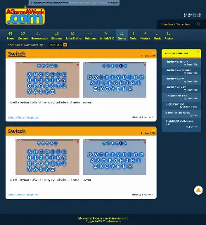
Yesterday I asked on the SoCoder forum if anyone could come up with a better look for the new AGameAWeek site, and out of all the comments, Rychan's sparked the biggest thought process.
-=-=-
As of last night, I've restarted retheming the rewrite of the site, following on from the general idea of his pictures.
I'll be trying to redraw my icons for the umpteenth time, and will be shuffling bits and pieces of the site around to see if I can get things looking a little more like his outlay.

It's a much neater presentation, but I'll still want to add a few extra elements, like the "Previous games" list at the top.
Other than that, though. Yeah, it's a lot cleaner, and more readable.
Hopefully, this time, things end up nicer than they currently are!

