|
|
New games every week!
The Redesign Continues...
Blog
26th May 2020
What am I doing to myself!?!
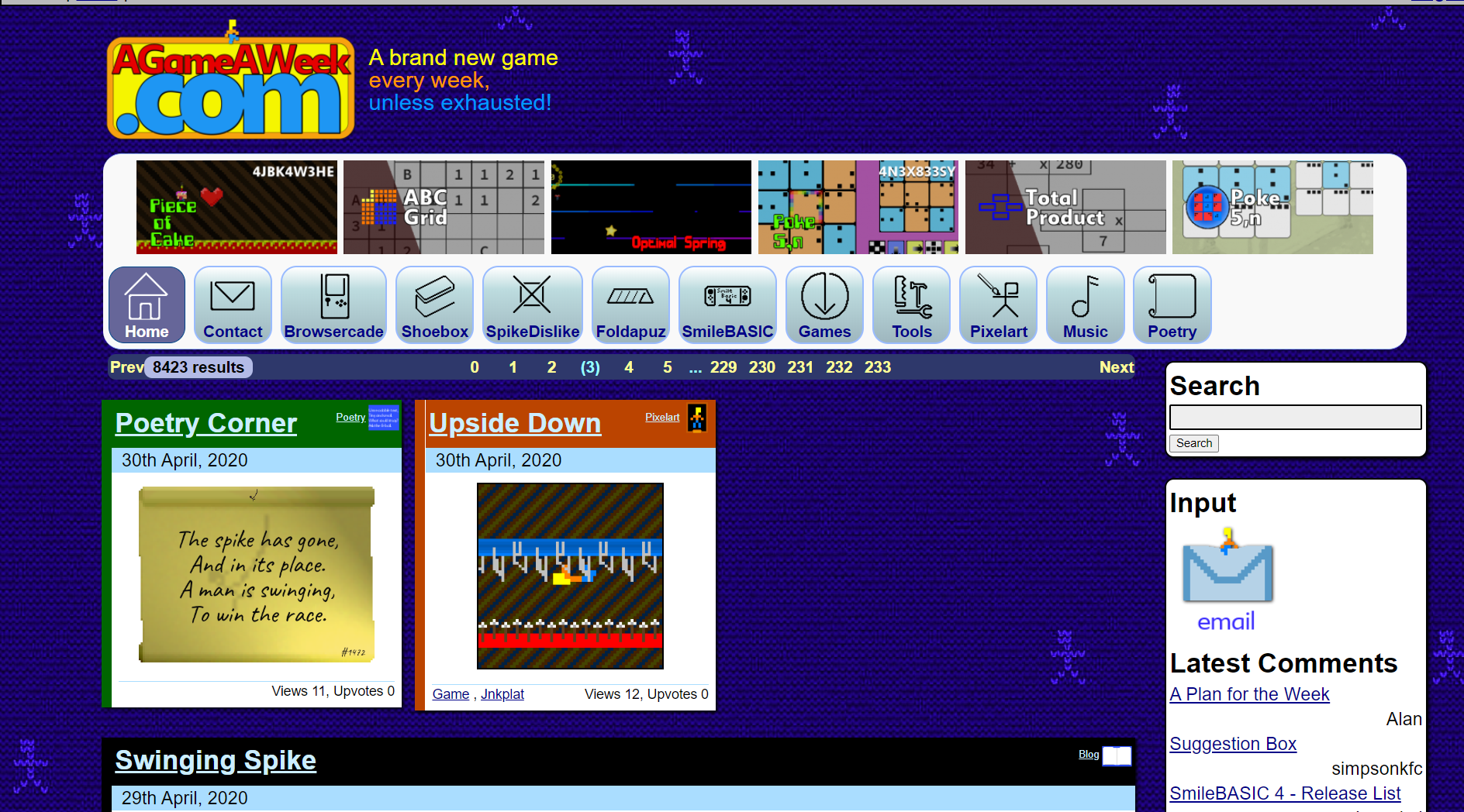
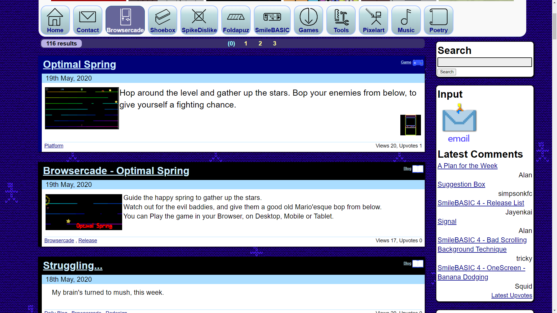
-=-=-  Right, the previous retheme has been scrapped, and a new one is currently in the midst of being done. More or less the same kinda deal, but keeping the basic style of the original, just with a couple of tweaks, here and there. For the most part, it looks roughly the same, but everything's a little bigger, so you won't have to squint as much. Issues so farThe current nav-bar (the little tab-buttons) is a little bit .. .. I dunno.. Bland!? I tried adding a subtle gradient, but I don't think gradients suit my style very well, so that'll have to go. Search is a single bar, nothing too complex, with complexity being added in once you click it. But then it all becomes the same sprawling mess that it used to be. I need to organise it a little better. The "two mini-view posts" no longer fit the width of the gap, since the gap supports three of them, leading to an odd daily occurrence where there's a space leftover. I need to figure out how best to format them to fit within the daily blog's space, I think, but that all messes up as soon as you try to use the Search function. And then there's the lack of visual difference between Blog and Game, as can be seen here.  There's just nothing that says "This is a game", vs "This is a blog post about the game", other than that tiny little icon on the top right of the box. I definitely need to make that more obvious. But otherwise, most of the tabs now function, and things still scale reasonably well to Mobile-view, which is good. It's kinda the same, but kinda different.. Coming soon : Hopefully, unless I give up again! Views 88, Upvotes 14
Daily Blog
,
Redesign
New games every week!
|


