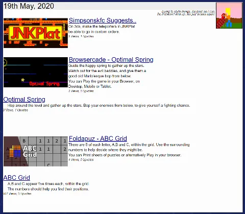
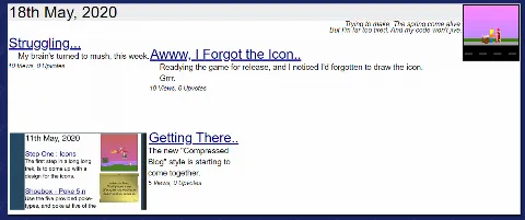
Most of yesterday's Site Redesign work was spent on shuffling CSS around and about.
-=-=-

Most of the time, things are filtering through the way they're supposed to.
I've yet to format how game-posts look, but blogs are showing up, images are being intelligently grabbed from the posts, the daily pixelart and poetry aren't taking up anywhere near as much space, and things seem to be more or less working.

But then, every so often, CSS does what CSS does, and things don't quite work out.
Silly CSS!
I need to pad out the sections a little so they don't do that. I attempted a "width:100%" on them, but that caused the top-most section to appear below the pixelart instead of halfway down.
Grrr!
It's definitely getting better, though. I think! .. Maybe!

