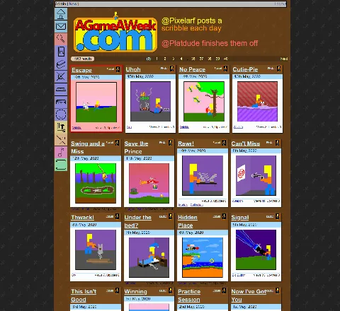
Got a fairly hefty part of the site overhaul working, yesterday.
-=-=-

(Ignore the red box around the first Pixelart. That's because it's not been Published, yet!)
This is "Standard" view, which looks quite a lot like how it currently looks, and thus isn't anywhere near as impressive as it could be!
Things of note.
1. The page background fits the colour of the tab, and the boxes.
2. The Page/Results bar is also colourised to match the page's theme.
3. The header's text is set to the Pixelart comment.
None of that worked properly a couple of days ago, and .. boy was it hard to tweak the site to do that properly!
But now all of those things are laid out within a giant array at the top of the script, instead of being hardcoded in various places, all throughout the thing.
It's a LOT neater!!
Things that aren't working.
1. The Pixelart tab isn't highlighted. I'm not sure why!!
2. A few of the headers are too big, and the actual content doesn't fit in the box properly. I might have to set an overflow setting for that.
3. A lot of the tabs still aren't functioning.. at all. I still need to rewrite the new frontpage/blog styling, before they all start to work.
Still oodles more work to do.
Stay tuned!!

