Day two of the AGameAWeek Overhaul, and I spent most of my time arguing with CSS again.
-=-=-
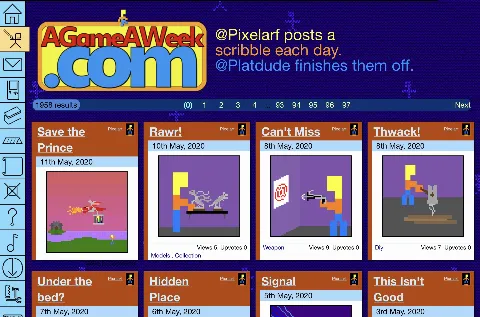
The new iconbar is always on the right, and the rest of the site is now left-aligned to match.
I did attempt to get it working centralised, but my CSS skills were having none of it, so for the moment, everything's strapped to the left of the browser.
I think I need... MORE BOXES!!
Either that or I cheat and make a good old fashioned table to house everything in!
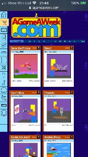
Anyway, with pure CSS and Javascript, the site can now rejig itself to being one of two widths. .. And actually does so, properly, this time!


The differences are in the font size, the small box width, and the overall site width.
Things, so far, seem to fit reasonably well into both views.
Site's still pretty much unusable, right now, since all of the icons are static and don't do anything, making even simple navigation unworkable.
There's a long long way to go, until all this is done.

